For our film opening, we were concerned that the video may be too complex for people to understand. To make it clearer, we created two versions, one with a voice over, and one with a alternate ending, which makes the opening far clearer.
On showing both openings to people, we saw that people found the voice over quite funny, and we feel that took away from the seriousness of the video we were trying to create. We also found that the alternate ending worked in explaining the opening as we had hoped, and got the reaction we wanted. Because of this, we decided the final video would be the one with the alternate ending. Both versions are below.
With Alternate Ending
With Voice over
Monday, 16 November 2009
Sunday, 15 November 2009
Evaluation Question One- In what ways does your media product use, develop or challenge forms and conventions of real media products?
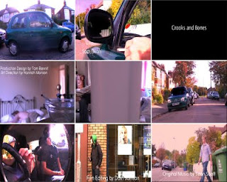
1st shot: This is an establishing shot of the setting where the opening takes place. Three people are seen sitting in a car and their identities are hidden. The shot was colour corrected and this plays into why you can't see the characters faces
2nd shot: We used a 4 point garbage matte in order to make the reflection of the smoker dark and once again so you can't see his face. The shot was also reversed so the cigarette is brought down at the start of the shot.
3rd shot: This is the title of our film. It rolls down with Rob pulling down his balaclava and rolls up again to reveal a panning down shot of Elliott sleeping.
4th shot: We gained a lot of praise for this shot. We lit a roll-up cigarette and put it hanging out of an ash tray. We changed the camera setting to manual focus and changed it so the foreground (roll-up) is focused and the background (Elliott and bed) are out of focus .
5th shot: This was one of the few shots where we used the dolly provided by the media department. A slight tint of red was put on the clip when the shot gets to the room where Max is sleeping and starts of blue in Elliott's room.
6th shot: Again a 4 point garbage was used to tint out the windscreen. The shot shakes down in a transition we created in the edit. This meant we had to keyframe the garbage matte so it fits the windscreen for every frame of the transition.
7th shot: This is an other shot we received praise for. This was one of the shots where we used the fish eye lens. The camera was placed on the dashboard and the shot was arranged from there.
8th shot: This shot was collected after the official shoot day whereby Rob and Elliott went to town and filmed this shot. It's placed outside a bank as this character is meant to be waiting to pull of the heist. In the alternate ending the shot is edited with a dazzle effect and is shown as a flash back as the script was tweaked for the alternate ending
9th shot: This is a panning shot of Max walking out of the house to the car. We timed this shot so Elliott behind the camera would signal Rob of when to open the window as Max arrived to the car.
Saturday, 14 November 2009
Evaluation Question Two- How does your media product represent particular social groups?
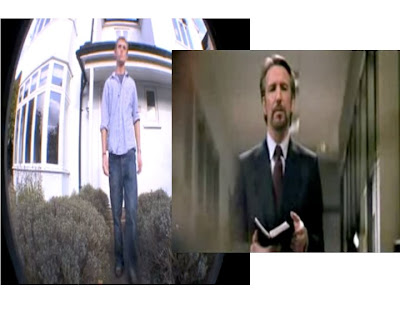
For this I chose the character that is played by Max, who at the end of the opening is revealed to be working with the people inside the car, rather then the people inside the car coming for him. This character is the only person in the car who's face is seen, suggesting he will play a large role in the film as it necessary for him to be followed throughout the opening.
Like Hans Gruber, Max plays a character that is calm, and knows thoroughly what he is doing, and both are committing an armed robbery. Max plays a character that is confident and gets about his day like any other with no problems, and his confidence is shown on screen, while Hans is also very confident, stating in 'Die Hard' "I am an exceptional thief". Both characters dress smart, as not affected by the possibility of being seen by cameras and want to be seen as someone with smart taste, Hans in 'Die Hard' compliments the suit of a man he is about to kill, saying "It would be a shame to ruin it", displaying a calm ruthlessness in both characters, as Max calmly takes the rub from Rob at the end of the opening.
Friday, 13 November 2009
Evaluation Question Three- What kind of media institution might distribute your media product and why?
For this question we recorded a commentary for our video, it can be found below.
Thursday, 12 November 2009
Evaluation Question Four- Who would be the audience for your media product?
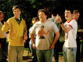
In media we created the target audience for our film, the ideal person that would go watch it, to aim towards in advertising.
We went with the main characters in 'Superbad'
How old are they- 17 and a half
What are they called- Rolliax
How do they dress- Casual, Hoodie and jeans
Where do they live- Anywhere on earth
What do they spend their money on- Games (Quake, COD, Halo), clothes (Hoodie and jeans), movies (Snatch, Kidulthood)
Where do they watch films- DVD, internet, cinema
What kind of music do they like- Pop music (So solid crew), download music
Leisure time- Socialising, facebook
How much TV do they watch- 2-3 hours per day
What is their favorite film- Pulp fiction
Wednesday, 11 November 2009
Evaluation Question Five- How did you attract/address your audience?
For this we used the annotation feature that YouTube provides for videos. It can be found below.
Tuesday, 10 November 2009
Evaluation Question Six- What have you learnt about technologies from the process of constructing this product?
Evaluation Question Seven- Looking back at your preliminary task, what do you feel you have learnt in the progression from it to full product?
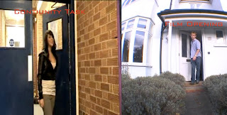
For our film opening we used a couple of skills we learned from the continuity task, and one of them is shown above. We used match on action for a door opening, the picture on the left side is the continuity task, and on the right is from our film opening.
We considered use of the shot/reverse shot (180 degree rule) for the brief moment two characters talk to each other, switching angles but decided against it, as we wanted the shot to be about the characters journey leaving the house rather than use conventions of a conversation.
Monday, 9 November 2009
Rating for our Film Opening
On the SBBFC (Student Board of Film Classification), there are guidelines for rating a film, and even though we have not had it officially rated, we can get a very good idea of what it would be rated.
Our film would have been rated '15', for strong violence, frequent strong language, strong verbal references to sex, and drug taking.
In order for our film to remain a '15', it must not encourage or promote the drug taking, which would not be the case in our film, as references would be brief.
Another reason the film would be rated '15' is because of the general dark tone of the film, and it's complexity, which younger people would not be able to understand and grasp.
Wednesday, 4 November 2009
Creative Risks
A risk that we took while filming was the use of the Fisheye Lens for some shots, this was risky because we did not know if it would truly work until we finished filming, and got the footage onto Final Cut, as we would not be able to re shoot the scenes.
I feel that it paid off, and the shots worked well, and it was a good creative decision to use the Fisheye.
I feel that it paid off, and the shots worked well, and it was a good creative decision to use the Fisheye.
Tuesday, 3 November 2009
Editing is in full swing
Today we made lots of progress in the edit for 'Crooks and Bones', and began to really get an idea of the finished piece. I was an hour late so when I arrived music was roughly in place and I got to hear it for the first time, which from then on I began hacking at the visuals to make it fit the music far better. I experimented with using the music as cues for the cuts and decided that it would be better to cut up the music more and make it fit the visuals more, rather than a solid audio track with nothing done to it. We recorded voiceover for the beginning in the car, and recorded the last missing shot all in 10 minutes. After getting it onto Final Cut we worked a lot more on the pacing of the video and the voiceover as one, changing shot ordering, length and speed to make it seem far more natural.
Sunday, 1 November 2009
Feedback for 'Something Wicked'
L3 - GROUP 1 (Christina & Angelica) Film Opening Rough Cut from cmdiploma on Vimeo.
Feedback for 'Something Wicked' by Christina and Angelica
I like the darkness in the video, how everything isn't quite explained, it adds to the mystery of the scene. The close ups work well, I like the detail in the scene.
I Dislike how some shots fade in and then the camera starts moving, it makes it look a little strange to see things start and stop.
I really like the titles at the beginning with the shake effect, I think the video is strong and will look authentic as a title sequence.
Monday, 19 October 2009
Reflection
The class was told to draw a picture to represent the best moment in our filming/editing process.
I attempted to draw a picture, but gave up quickly as I cannot draw. Nick asked me to upload it anyway.
The picture was suppost to be of the fisheye camera view of us all inside the car, creating a really good shot.
Sunday, 18 October 2009
Fridays filming
On friday our group set off to Max's house to record our film opening, and it was a strong success.
With five roles in the opening and three people, Max and I played an additional character each. We spent the morning recording the exterior shots, around and inside the car, and used the fisheye lens for the inside of the car which provided a fantastic shot. For the characters inside the car we cut up a vest and turned it into three balaclavas, which worked well.
In the second half of the day we had the camera dolly as well as the fisheye lens, which we used for three shots and worked very well. Max and I changed and played characters inside the house, and Rob filmed the majority of the shots inside the house.
The filming is now complete apart from three shots which can be done at a later date.
Tuesday, 13 October 2009
Animatic
Over the day, Max and Rob drew storyboards which we had already roughly drew a few days before. With these much neater storyboards, I took a photo of each of them and imported them into Final Cut, and estimated how long each shot would last.
At the end of the day, we came up with a short script for a rough voiceover for the beginning, and recorded it for the animatic.
Monday, 12 October 2009
continuity task
we created a short video to demostrate match on action, and the 180 degree rule.
the 180 degree rule is that when filming a conversation, the camera should always stay both sides of the same line, as not to confuse the audience.
match on action is that when you cut to another angle, the action should continue as if it was not two seperate shots.
this is the video i created with ali
http://www.youtube.com/watch?v=1ZgIOEgmoIA&feature=player_profilepage
Sunday, 11 October 2009
Ident
My Ident for my production company, Boneyards
I started by finding an image of a shark, and made an Opie of it on Photoshop.
I then found a second image of water for the background.
Putting both into Final Cut, I animated the shark, and added text and music.
L3 ELLIOT (Boneyards Productions) IDENT from cmdiploma on Vimeo.
I started by finding an image of a shark, and made an Opie of it on Photoshop.
I then found a second image of water for the background.
Putting both into Final Cut, I animated the shark, and added text and music.
Tuesday, 6 October 2009
Nine Frames
25 word pitches
Action film pitch- A bank robbery goes wrong as relationships break down between the people responsible and things turn out to be far diffrent than planned.
Supernatural film pitch- Life is far from normal for one young woman, who is trying to balance her life and her supernatural skills to create a normal life for herself.
Independant film pitch- Coming of age tale as a young boy begins to learn about the world his parents have covered him in collon wool from.
Animated feature film pitch- A couple try and discover the truth behind the grizzly noises heard from their bedroom window at night.
Sunday, 4 October 2009
Friday, 2 October 2009
Credits list
A Boneyards productions presents A Long Road Film (cast) David Skinner (cast) Sam Dilan (cast) Alison Ford Costume Design by James Hendon Art Direction by hannah Manson Production Design by Tom Bennit Casting by Anna Ross Film Editing by Dorn Samson Cinematography by Dody Zimmer Original Music by Sean Scott Produced by Elliott David Directed by Jamse Handson Main Title.
Moodboard- Text
Moodboard- Pictures
Monday, 28 September 2009
Feedback
This is a start elliott, but there is still a lot more needed- clips should be embedded wherever possible and you have not completed everything yet by any ,means- see task 5 from last week.
if you are to achieve your best, the blog must be up to date with the work you are set!
if you are to achieve your best, the blog must be up to date with the work you are set!
Juno Opening.
http://www.youtube.com/watch?v=E1Luk2jezCA
My opening scene for 'Juno'.
We were put into groups of four, and we all watched the opening scene many times, in order to get an idea of what we would be creating.
Together in groups, we began making notes, this was a shot list and storyboard for the day, and a list of props we would need to make it look more like the actual opening scene.
On the day, I went out before my group to look for places to record, to help speed up the process when it came to getting all the equipment and recording, and found several areas around coleridge that would work out. Later on, we found it easy as a group to get started, working together with the storyboard to quickly get the shots we needed. We improvised most the way, picking places that we could get away with quickly when we realised that it would take far more time to shoot than we thought. After about 2 hours of walking around, recording, climbing trees and skateboarding, we were ready to return to class. I captured all the video into clips with what little time we had left in the day, and that was the end of the day.
On Friday, I got the footage I had uploaded a few days before, and edited with Christina.
I would like to say that we had the most amazing teamwork we had going on, it would have blown you away if you saw the skills we had.
For the editing, we tried our best to keep the time of all the clips the same as they were in 'Juno', but quickly learned this wasn't going to work out, and with time not on our side, we quickly began editing to try and make it look as much like the opening scene. We tried some ideas such as cropping frames and overlapping them to try and recreate the same look 'Juno' has. We also tried to use the same sliding transitions, to try and make it work better.
I feel we put in a good effort, and it looks somewhat like the opening scene, which, for the first project of the year is pretty good I think.
Student Film Opening Analysis.
http://www.youtube.com/watch?v=Z5YrrR7fuJ8
Student opening scene called 'Beyond Reflections'
I liked the idea, but the video felt very random, like it had no direction and everything was just jumbled up. The music felt very out of place and I think that even though the idea is good, and the entire video had potential to be something genuinely scary, it gave the opposite effect.
The visuals are strong, but the way the clips are put together makes the video seem to have no point or direction.
However, it is clear that a lot of work went into gathering all the footage, and the effort pays off in showing something that, however cliche, is scary.
Film Opening Analysis.
http://www.youtube.com/watch?v=Gtxq41Y0kzM
Opening Scene for Death Race. Pretty damn kickass.
http://www.youtube.com/watch?v=a0mx0dBXkw4
Opening Scene for Blade. Badass all the way.
http://www.youtube.com/watch?v=-XzNIUt1dBQ
Opening Scene for Memento.
Memento is the opening I had not seen before, and I was very intrested by what I saw.
It seemed to be quite low budget, from the slow unintresting titles, to the very basic shot of just the polaroid, as steadily the audience gains an idea that it is being reversed. Everything was very basic yet what was seen was all there to intrest further, which leads to suggest that the main force of the the film was it's story.
Monday, 21 September 2009
Feedback
For the post on Shifty, you need to say more about how the moodboard task worked and how it was based on a particular scene and trying to give a sense of atmosphere from that. Later you will be creating moodboards for your own project ideas.
You could do with a bit more detail in your post on how you used the technology (especially final Cut) Which tools did you use?
This blog will be the evidence of your research and planning for the AS coursework, so there needs to be lots on it and lots of detail to it.
All the tasks set will help build up this evidence, so if you don't complete them you will not be able to access the higher marks/grades.
Please update the posts from the lessons and do the homework, which is now late, for me to be able to give you feedback tomorrow.
Pete
Thursday, 17 September 2009
Photoshop Exercise
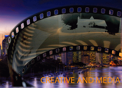
We were given the task to create a postcard to promote the Creative and Media course, and this was also used as an exercise for using Photoshop.
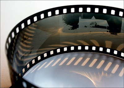
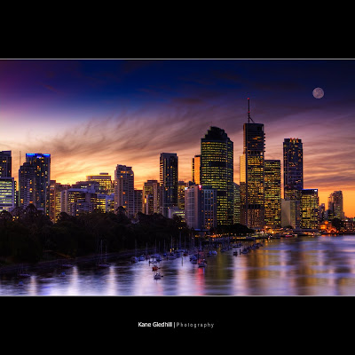
Using two or more images relating to Media we found on 'Flickr', we were to combine them and add text.
I used two images, which I have uploaded below, and removed the background to one of them, and added text.
I'm happy with this, as this is by far the best thing I have ever created on Photoshop, as I knew next to nothing when I began this lesson.
Wednesday, 16 September 2009
Final Cut Practice
I made this video with Hannah, using stock footage and half an hour using Final Cut at Coleridge.
We used transitions an other effects to create a random video which got us used to Final Cut.
We used transitions an other effects to create a random video which got us used to Final Cut.
Tuesday, 15 September 2009
Saturday, 5 September 2009
Subscribe to:
Comments (Atom)


